


How do you design a book cover without giving it all away?
I didn’t want a “pretty” book cover, I wanted one that made people feel something. Here’s how I finally got there.

How do you design a cover for a book that’s about obsession, delusion, and decay without spoiling the experience, but still communicating what it is?
I’ve never made a cover like this before. I love making thriller/horror art and covers...

But Glowrot is a book that feels impossible to explain with words, so imagine trying to do it visually.
All the obsession, delusion, the wanting, and the destruction that comes with it.
It’s slippery and surreal and strange, and the thought of putting a face to that felt so absurd.
But I had to try.
I knew from the beginning I didn’t want it to be literal, boring, or vague.
I wanted the cover to communicate what the story feels like. I wanted someone to look at it and sense something was off, even if they couldn’t say why. I wanted it to disturb them a little.
And for a long time, I couldn’t get there.
I tried so many concepts.


I mocked up dozens of versions. They weren't uncanny enough, off enough, surreal enough.
Some were beautiful but completely wrong.


They didn’t scare me. They didn’t ache. They didn’t haunt me and they weren't going to haunt my readers either.
One of the concepts I put together was this layered, distorted image of me as Bo, screaming and fragmented.
It had this cool, chaotic visual energy to it... But that was it.

When I stepped back, all I could see was a poster. It didn’t feel like a book cover, it didn't communicate what the story was about. It was just... a cool visual.
And even though people on social media loved it and even said they would absolutely buy a book with that as a cover, I still wasn’t convinced.
It was missing something. It didn’t hurt. It didn’t haunt. It didn’t tell the truth of the story the way I needed it to.
Eventually, I had a breakdown. I thought: maybe this is it. Maybe I’m just not good enough to make this cover.
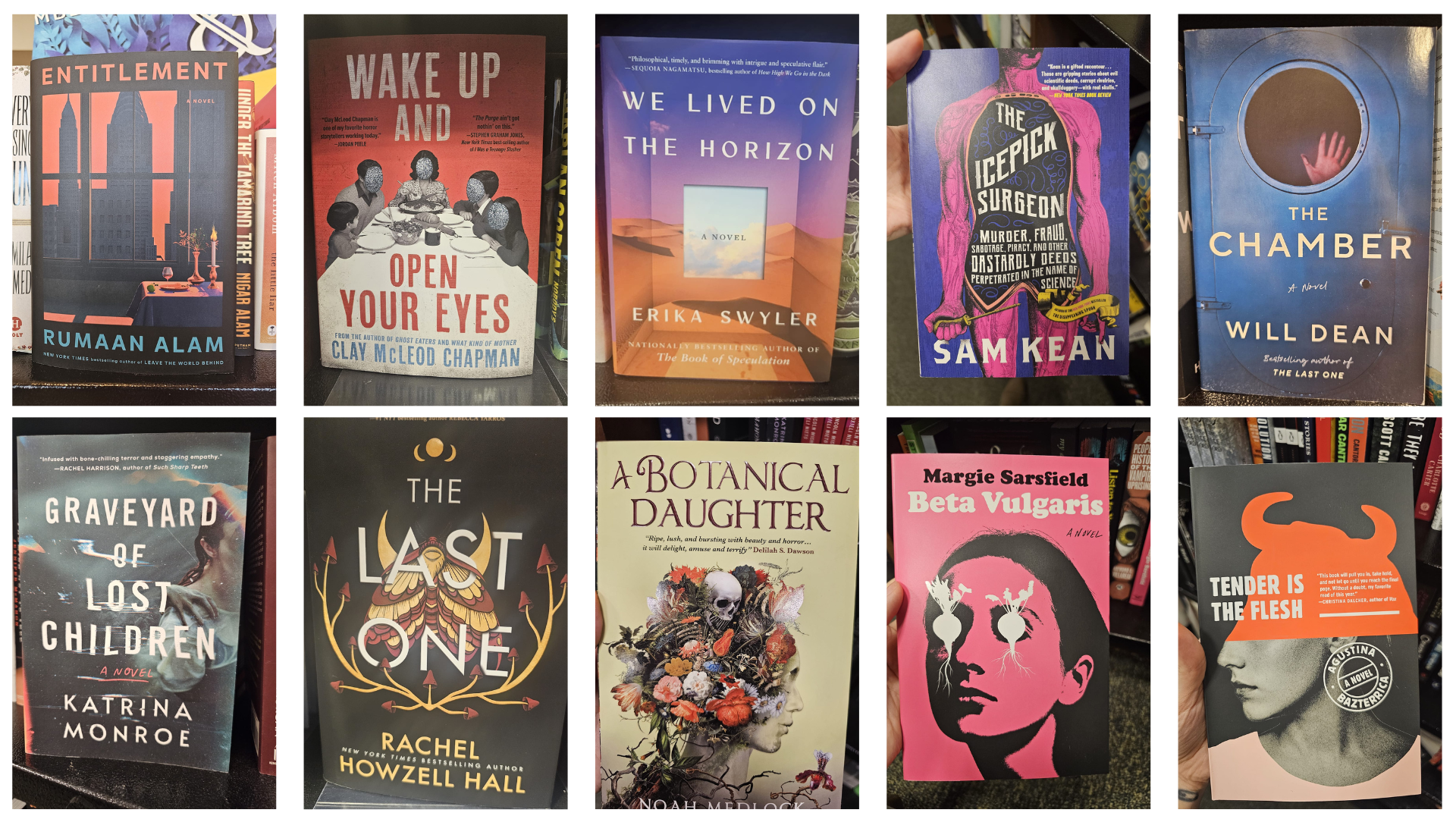
What finally pushed me to move forward again was a trip to Barnes & Noble. I went in on impulse with my boyfriend and ended up spending hours just walking through the aisles, pulling books off the shelves, taking photos of everything that caught my eye. Horror, literary fiction, thrillers, even romance. I wasn’t looking for something to copy, I was looking for a feeling. Something that made me stop and stare, something that spoke to me.
A lot of the covers I found, especially the ones in the horror section, were so devoid of anything interesting. There were rows and rows of titles and subtitles that gave away the whole story and were just put on top of generic photographs. They all looked the same, I couldn't even differentiate one from another. It was disappointing.
Still, I filled my phone with reference photos of the ones I found resonated with me. I studied what worked and what didn’t.

What finally changed everything wasn’t a design breakthrough, it was a sketch.
I had talked to my boyfriend about this idea of liquefying someone's silhouette to create a distorted image of them and then he doodled something that clicked. It unlocked the answer to everything I had been looking for.

So I doodled my version of it as well.
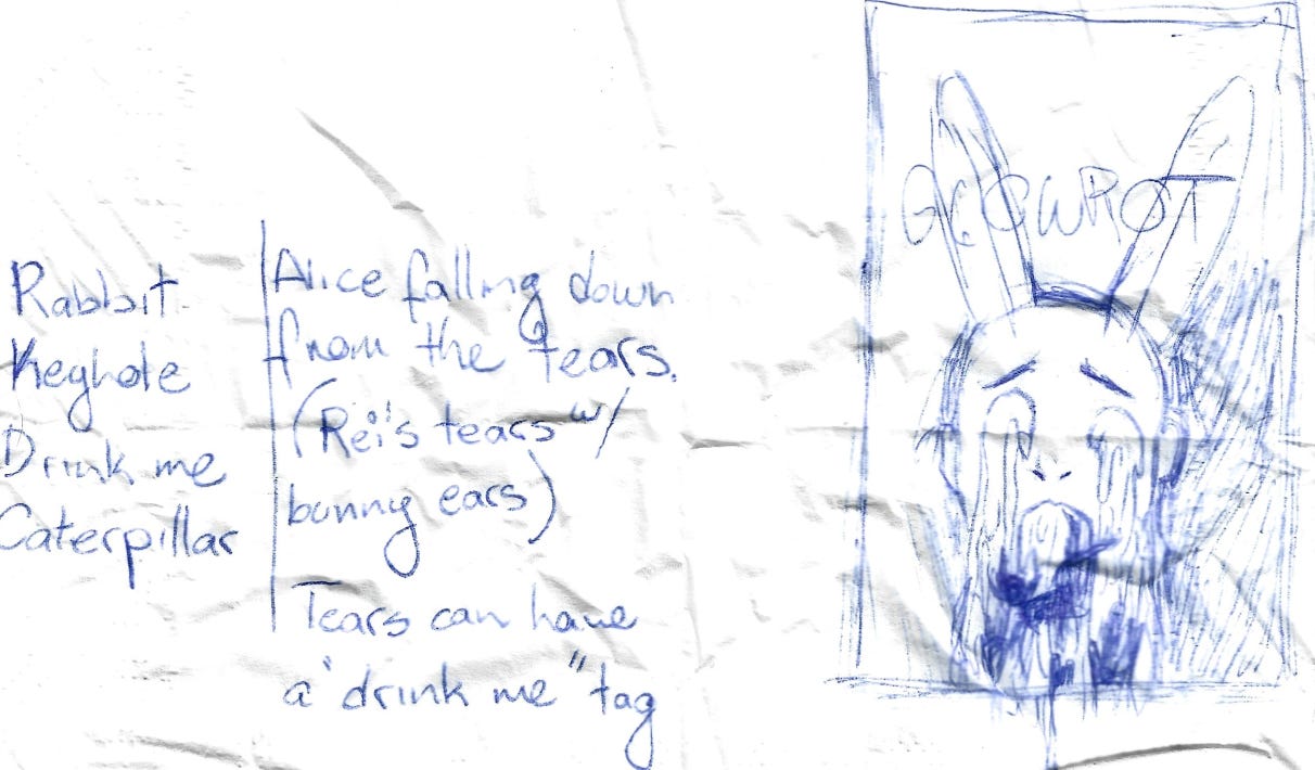
It was everything I had tried to explain about the story, without needing words.
Once I let go of “pretty,” the design started to breathe. I gave it heat. I gave it bile. I gave it contrast. A layout that made me feel slightly nauseous. And that was when it started to feel like Glowrot.

I’m proud of this cover. Not because it’s clean or clever, but because I didn’t quit. Because I pushed past the part where I wanted to give up, and I made something that felt true.
Here’s what I won’t do:
I won’t tell you what this cover is supposed to mean.
I won’t tell you how to feel when you look at it.
Because Glowrot doesn’t work like that.
This book isn’t trying to explain itself. It’s trying to hold a mirror up to the ugliest, most haunted parts of you, the parts you hide under mental gymnastics and pretty language. I wanted the cover to do the same.
If you see something in it, that’s yours.
I know what it means to me. I poured every part of myself into it. And now it’s yours to look at, wonder about, get disturbed by. Or maybe even feel a little seen.